
In this blog post, I will explain Exploratory Data Analysis (EDA) in a straightforward way and then demonstrate how to apply EDA using a spreadsheet-like visualization tool, OPTIMIBI, which was designed to help both beginners and intermediate users understand the value of EDA and how to conduct basic descriptive statistics and visual explorations.
Part 1: Understanding Exploratory Data Analysis
1. What is EDA?
Exploratory Data Analysis (EDA) is the process of exploring, visualizing, and summarizing data to uncover patterns, relationships, and potential anomalies before you dive into more advanced methods like modeling or forecasting. EDA forms the foundation of any data project because it helps you:
- Understand the structure (columns, data types, relationships) of your dataset.
- Detect quality issues (missing or duplicated data, outliers, wrong data types).
- Develop initial hypotheses about what drives the patterns you see.
- Decide what further analyses or modeling techniques might be appropriate.
In essence, EDA helps you ask better questions about your data and sets the stage for more rigorous analyses.
2. Why is EDA Important?
Data Quality Checks
You can’t trust your insights if the data is full of errors or incomplete. EDA reveals issues with missing values, inconsistencies, or out-of-range numbers so you can fix them early.
Feature Understanding
By examining distributions and correlations, you find out which features (columns) are relevant or redundant for potential models.
Risk Mitigation
Early detection of anomalies or data-entry mistakes prevents misinformation from making its way into dashboards or predictive models.
Better Communication
Clear visual summaries and descriptive statistics make it easier for stakeholders to see the data’s story and build trust in subsequent findings.
3. Common EDA Methods and Steps
3.1 Descriptive Statistics
Descriptive statistics summarize and provide insights into data, making it easier to understand trends and patterns without complex analysis. These statistics fall into three main categories:
- Central Tendency: Mean, median, mode.
- Spread: Variance, standard deviation, range.
- Distribution Shape: Skewness (left- or right-skewed), kurtosis (heavy or light tails).
How They Help:
- Provide a quick snapshot of your data.
- Help in comparing different groups or categories.
- Indicate whether a feature might need transformation (e.g., log-scaling for highly skewed data).
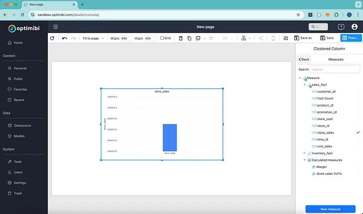
For example, to compare sales revenue by stores, we start with a Column chart using the Workshop Model (i.e., Foodmart dataset).
Select a model to start creating an analysis chart and choose store_sales as the measure. The summary of all store sales is visualized as a single column.
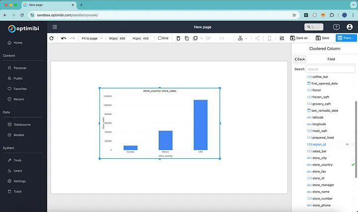
To see store sales across different countries, we add store_country from the store dimension.
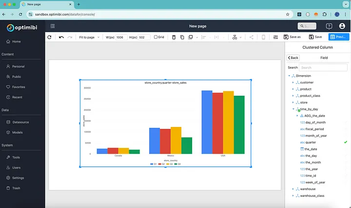
Next, to analyze sales fluctuations throughout the year, we add quarter to the chart.
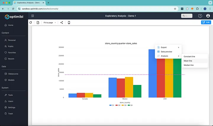
Finally, we add a line to indicate Mean Sales, highlighting store performance against it.
3.2 Visual Explorations
The sample report can be accessed from OPTIMIBI’s sandbox. It is a read-only report, but registration is FREE to create your own analysis using built-in chart types:
- Univariate Plots: Histograms, box plots for individual variables.
- Bivariate Plots: Scatter plots, bar charts, or line charts to compare two variables.
- Multivariate Plots: Correlation heatmaps, scatter plot matrices, or parallel coordinates.
How They Help:
- Quickly spot trends or outliers.
- Identify relationships (correlations) among variables.
- Make the data more understandable for both technical and non-technical audiences.
Conclusion
Exploratory Data Analysis is an indispensable step for anyone working with data — whether you’re an aspiring data scientist, a business analyst, or a manager looking to make sense of a sales report. By:
- Cleaning the data (handling missing values, incorrect types),
- Summarizing with descriptive statistics (mean, median, variance), and
- Visualizing relationships and outliers (through pivot tables, charts, or Z-scores),
You build a strong foundation for any subsequent modeling or reporting. Using a spreadsheet-like visualization tool such as OPTIMIBI keeps things accessible, ensuring that both technical and non-technical teams can explore data, spot trends, and present findings in a clear, interactive format.
For more information about OPTIMIBI, please send your questions to info@optimibi.com.
